
| ‣ Logos |
| ‣ Branding |
| ‣ Digital Content |
| ‣ Websites |
| ‣ UX |
| ‣ About |
| ‣ Contact Me |
| Home |
|
|
|
A recipe library for Italian restaurants designed as an app and website.
How can a restaurant keep its signature gourmet dishes consistent in taste, flavor and texture when prepared by the cooking staff.
Creating an easily accessible library recipe app available to all the cooking staff.
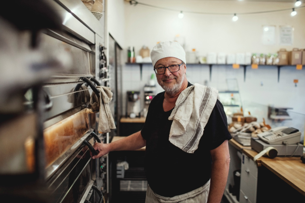
The primary users of this app are for any cooks and chefs making the gourmet Italian dishes for the restaurant.
After surveying and talking with individuals that prepare gourmet dishes, a few pain points were identified.
The dishes cooked by the cooking staff vary in taste flavor
Users need a way to watch how a particular dish is prepared
Users need an app that contains live text so that their viewing device is able to translate the text into multiple languages
The video recipes should have live text captions so that they can also be translated into other languages
| Age: | 50 |
| Education: | Cullinary Institute |
| Hometown: | Los Angeles |
| Family: | Wife and kids |
| Occupation: | Restaurant Cook |
Juan needs to prepare the restaurant's gourmet dishes with consistency.
| Goals |
Frustrations |
|
|
Juan loves to cook gourmet foods and wants to use his cullinary skills to treat the restaurant's customers to tasty satisfying meals!
| Action | Veggie Lasagna Customer Order | Sign in to App | Find the Recipe | Read Recipe Contents | Prepares and cooks the dish! |
| Task List | Juan has a customer order for a veggie style lasagna dish | Signs into the recipe app | From the homepage, clicks on main category - Dishes | Reads the recipe Watches the how-to-video |
Prepares and cooks the recipe |
| Feeling Adjective | Knows that he does not remember this recipe | Feels relieved that the recipe app is available Feels good that a sign-in is only required periodically |
Feels good that the recipe dishes are easy to find | Likes that the recipe is detailed and can view all the ingredients easily Likes the supplementary video Likes the ability to translate text into multiple languages |
Feels good that he was able to use the app to read the recipe and make a dish for a happy customer |
| Improvement Opportunities | Create a voice dictated search option |
In designing the app, these were some of the accessibility considerations that were noted as features that would be helpful to the user.
Language Translation:
The inclusion of live text is important so that language translation can be performed by the
viewing device
Video Captions:
Having captions on video is also important so that text can also be translated into multiple languages
Screen Reader:
For the recipes, it’s especially important to have live text so that screen readers are able to read the text out loud
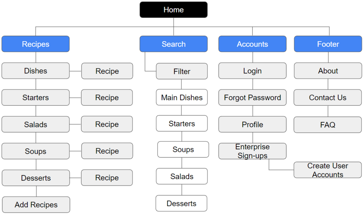
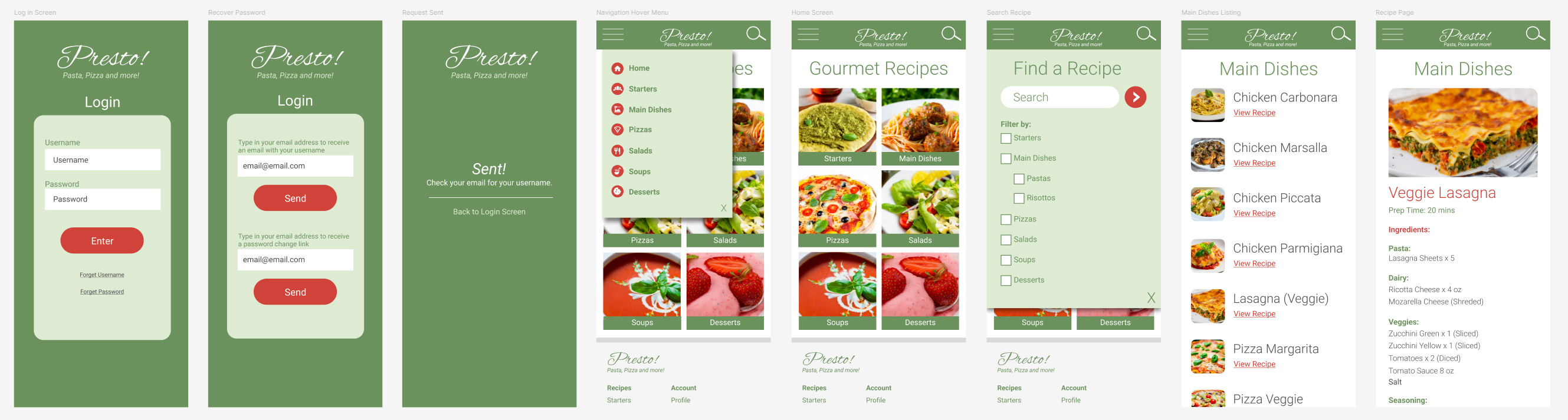
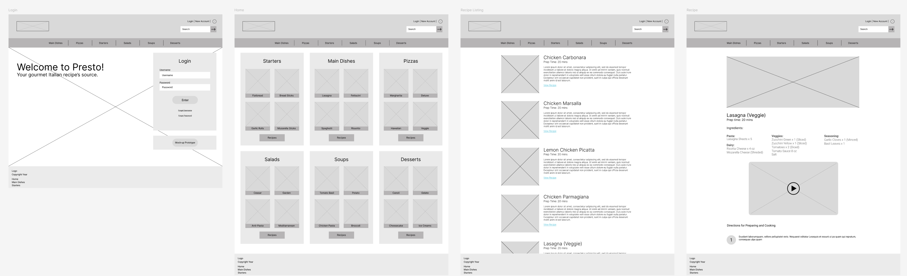
As seen below, this is the app and website site map displaying how a user would navigate the app or website to find the specific recipe they are looking for or other section they are searching for.
My goal was to create an app that is logically categorized by meal type making it easy to find recipes. I included a search engine function as well to make the app even easier to use.
For the recipe categories, I wanted to make these prominent and easy to find at a glance.
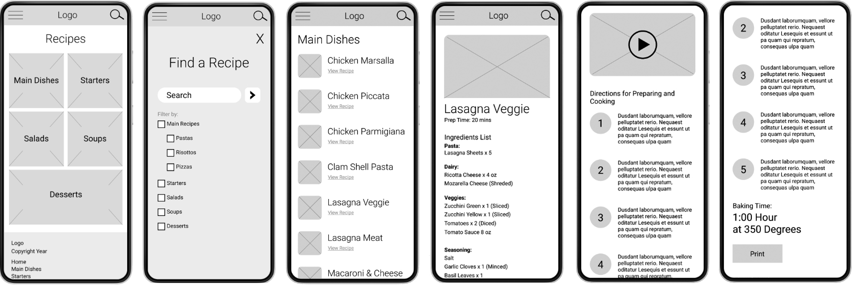
In this app, I want to include a search engine with optional filters for quickly locating recipes.
Each recipe entry will include a preview image, ingredients list divided into smaller groups,recipe directions and an example video of the recipe.
I conducted both a moderated and unmoderated usability test with the digital wireframes. The findings went well as the users were able to navigate the low-fidelity prototype easily and able to view a sample recipe.
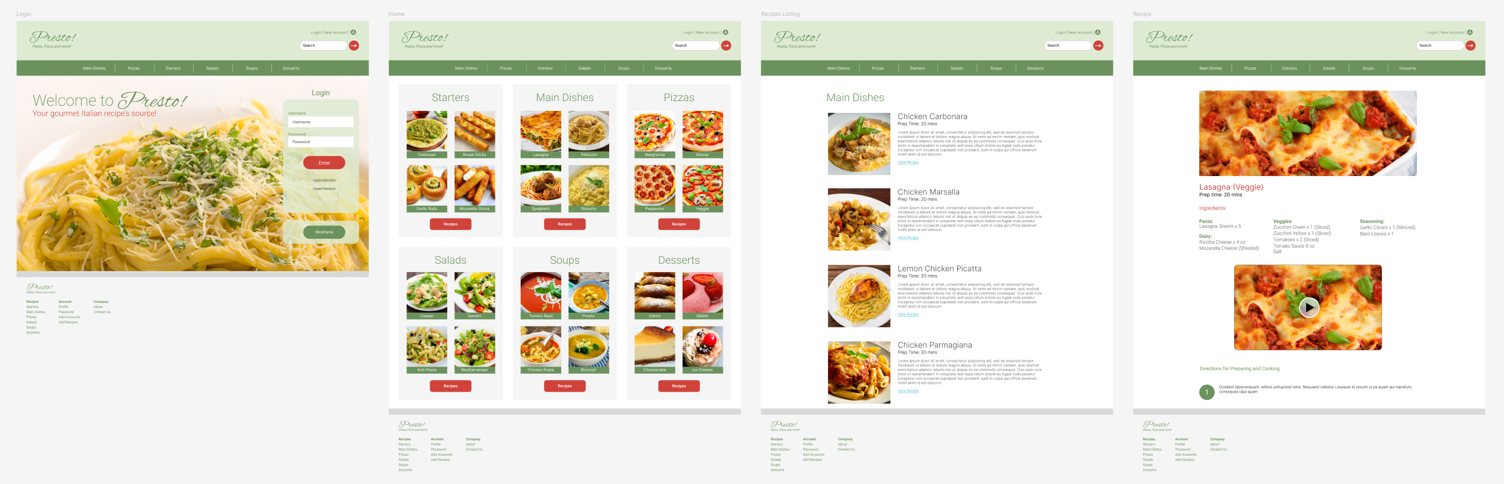
With this testing complete, it was time to start creating mockups and hi-fidelity designs.
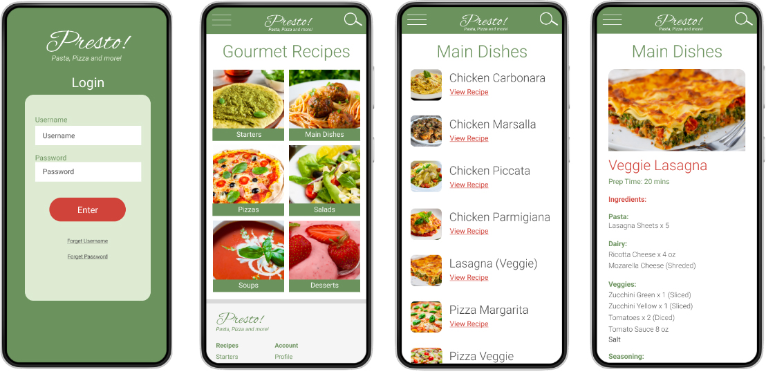
After the function flow of the website was set in the wireframing phase, it was time to move onto the visual look of the app. For the design I chose a primary tint olive color with a red color as an accent. For the fonts, I chose a standard sans-serif font making it easier for users to read at a glance.
Once the imagery, buttons, colors, and fonts were set, the mockup was ready for it's prototype setup. The prototype can be viewed and interacted with from the links below.
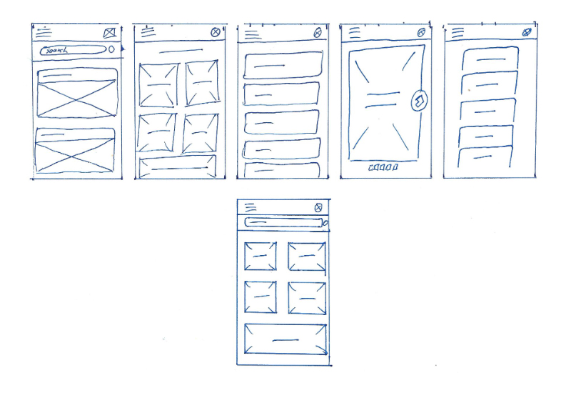
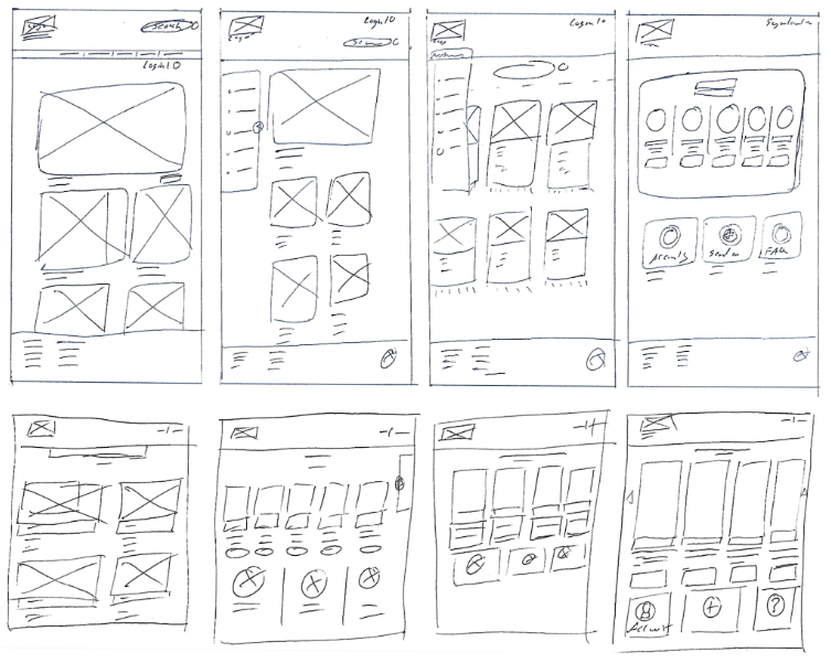
I had a variety of versions for the desktop site, and after a few ideas, combined some of my preferred components and then assembled them together for the digital wireframes.
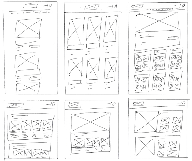
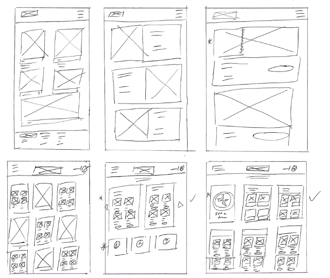
For the layout of the website homepage, I wanted to list all the main categories for the recipe types. Like the app, I kept the same recipe listing and recipe page layout.
Once the layout and function design was set in the digital wireframe, it was time to add the imagery, colors and other design features. Like the app, it keeps the same brand colors and overall visual look.
With the completion and launch of the recipe app and website, user feedback will be welcome as part of the normal iterative process and will be used to enhance the app.
|
|||

